Visual Climate Communication Emerges as Key Approach to Address Perception Gaps — InnoDexis Analysis
An academic initiative highlights how translating environmental data into visual narratives may improve public understanding and engagement with climate challenges.
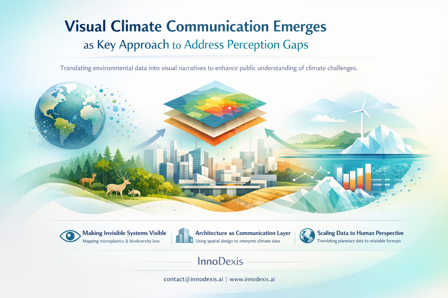
InnoDexis has published its latest Innovation Intelligence Report covering climate communication and visualization approaches, analyzing emerging academic-led innovations in environmental data representation. The report reveals that while climate data availability continues to expand, limitations in public comprehension persist due to the abstract and large-scale nature of environmental information. New approaches focused on visual storytelling and spatial representation are being explored to translate complex climate signals into formats that are more accessible and interpretable.
Key Findings
An academic studio at Yale University is exploring alternative methods of climate communication by shifting away from traditional report-based formats toward visual storytelling techniques. These include cartography, drawings, and collage-based representations designed to convey environmental data in more intuitive formats.
The initiative focuses on making invisible environmental systems visible. Areas of emphasis include microplastics distribution, biodiversity loss, and broader ecological shifts, which are typically difficult to observe directly. Visual mapping techniques are being used to represent these systems spatially.
Architecture is being positioned as a communication layer rather than solely a built environment discipline. The approach extends architectural practice into the domain of meaning-making, where spatial and visual tools are used to interpret and communicate complex environmental data.
A key dimension of the work involves scale translation. Planetary-scale climate data is reformulated into human-understandable visual formats, enabling individuals to engage with information that would otherwise remain abstract or inaccessible.
The shift from text-heavy reporting to visual-first communication reflects a broader reconsideration of how climate information is delivered. The emphasis is on perception and interpretability rather than volume of data.
Strategic Insight and Trend Analysis
The findings indicate that the primary constraint in climate communication may not be the availability of data, but the ability of audiences to interpret and internalize it. As climate datasets grow in scale and complexity, traditional reporting mechanisms may be insufficient to translate information into meaningful understanding.
Visual communication approaches address this limitation by converting abstract data into spatial and visual representations. By making environmental systems visible, these methods reduce cognitive barriers associated with interpreting large-scale or slow-moving phenomena such as biodiversity decline or pollution accumulation.
The positioning of architecture as a communication interface reflects a broader interdisciplinary convergence. Design, data science, and environmental research are increasingly intersecting to produce new forms of knowledge representation. This suggests that future climate communication strategies may rely less on textual reporting and more on integrated visual systems.
The transition from data-heavy communication to perception-oriented formats represents a structural shift. Rather than focusing solely on information dissemination, emerging approaches prioritize how information is experienced and understood. This indicates a move toward engagement-driven communication models in climate science.
Global and Industry Implications
For corporates and R&D teams, visual climate communication methods may provide new tools for translating sustainability data into formats that are more accessible for stakeholders, including employees, customers, and partners. This could support more effective internal and external alignment on environmental initiatives.
For investors and capital allocators, improved visualization of environmental risks and impacts may enhance the interpretability of sustainability metrics. Clearer representation of climate data could support more informed decision-making in areas such as ESG evaluation and long-term risk assessment.
For policymakers and national innovation bodies, the findings suggest that communication strategies may need to evolve alongside data generation efforts. Making climate data more interpretable could support broader public engagement and improve the effectiveness of policy implementation.
InnoDexis Statement
“The data indicates that the limitation in climate action may increasingly lie in interpretation rather than information availability, with visual communication emerging as a critical interface between complex environmental systems and human decision-making,” noted InnoDexis in its latest intelligence report.
Conclusion
The analysis highlights a growing emphasis on how climate information is communicated rather than solely on how it is generated. As environmental datasets continue to expand, the ability to translate complexity into accessible formats may influence engagement and response. Visual storytelling, spatial mapping, and interdisciplinary design approaches represent emerging tools in this transition. Continued observation of these methods will be important in understanding how communication frameworks shape climate-related outcomes. The complete Climate Communication and Visualization Report is available to InnoDexis subscribers and enterprise clients.
About InnoDexis
InnoDexis is a global Innovation Intelligence platform that tracks, analyzes, and interprets breakthrough innovations, prototypes, and emerging technologies across industries and countries. Its intelligence helps corporates, investors, and policymakers understand the true structure and direction of global innovation. Learn more at innodexis.ai.